Creating different layouts for various device sizes (“Device Targeted Forms”)
The TrialKit mobile app takes a clinical trial beyond the computer screen. When building forms and surveys for a study, as a form builder, it's tough to create a form that looks good on the various screen sizes that might view it down the road. After all, one size does not fit all.
Forms created in TrialKit can easily be made to display well on multiple device types and screen sizes. This gives form builders control over form layouts across the various devices users use for entering study data. For example, a physically wide form (e.g. a log form) that looks good on the web, when opened on a mobile phone via the TrialKit app, would run off the screen forcing the user to scroll horizontally back and forth to see the entire form, which can be challenging to a user.
TrialKit provides an automated tool for study builders to take a form they've built and rapidly set it up for multiple devices, allowing ease of entry while maintaining a single streamlined dataset in the end.
The steps below outline how to target form layout for multiple devices. These steps only apply to study builders.
Device Dictionary
Prerequisite
User has access to the Device Dictionary within the Host level role security menu on the app.
This configuration setting is currently only available on the mobile app.
In the host slideout menu, tap on the Device Dictionary:
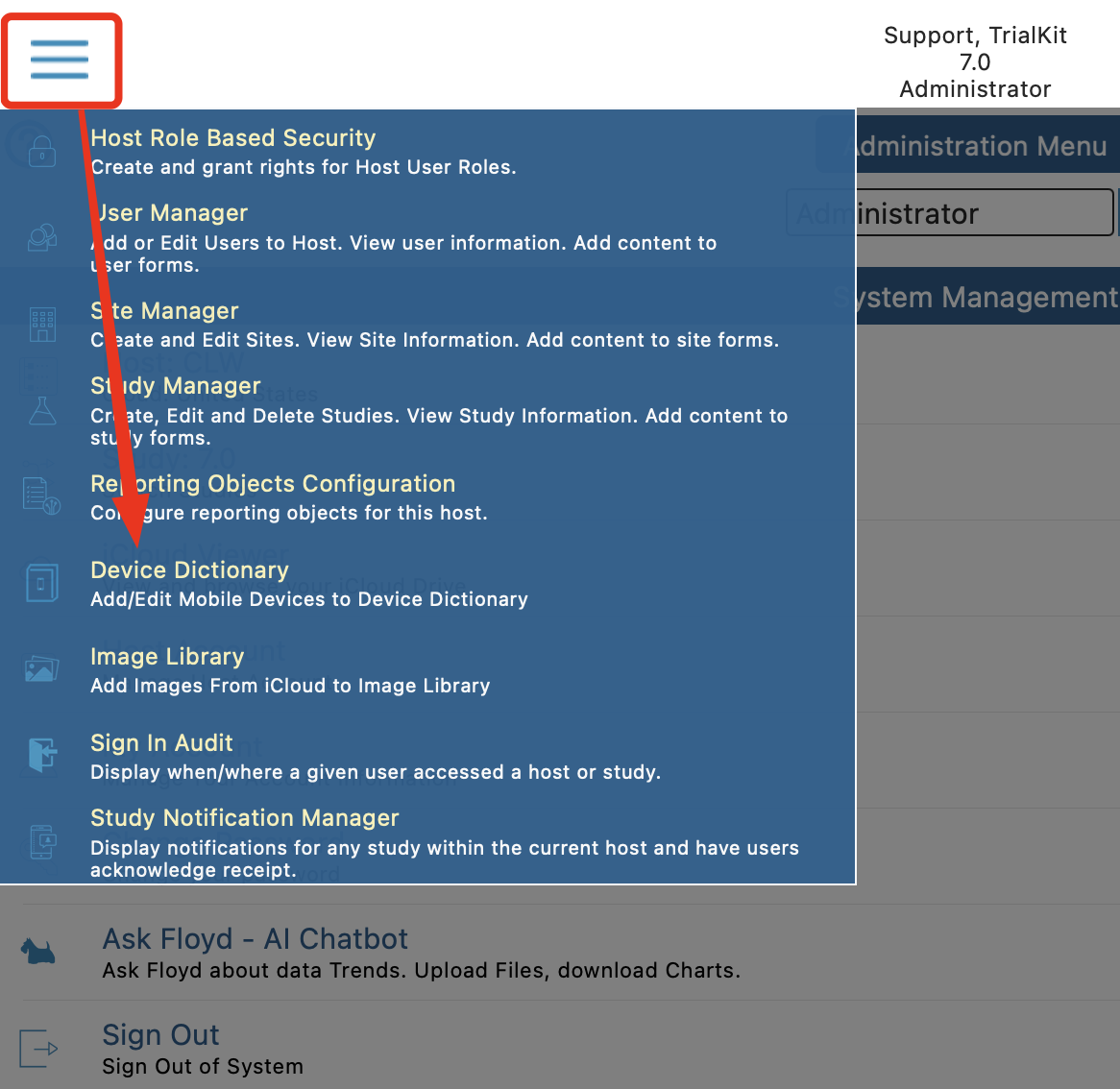
This is where device sizes and languages will be defined for using in the form builder, as described later in this article.
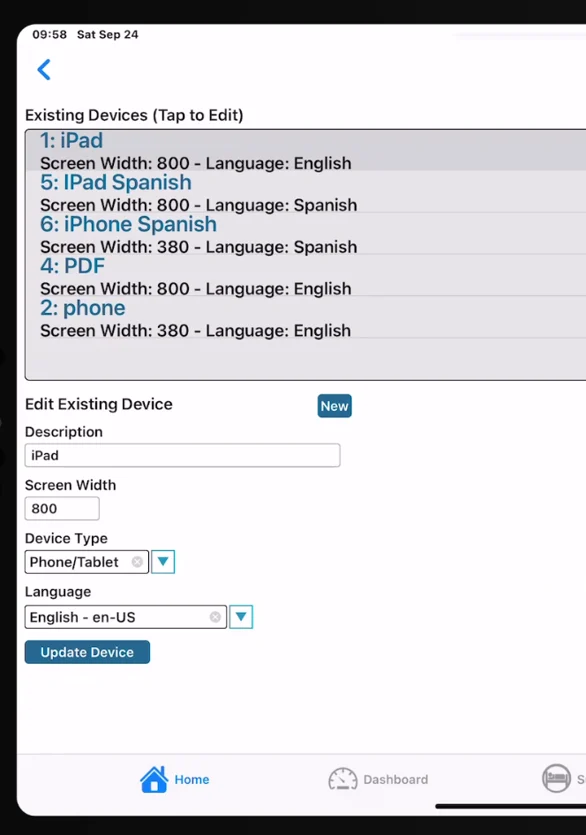
If you are not sure which screen sizes to target, especially for ePRO studies where subjects use their own variety of devices, that’s okay. Creating 2-3 size options is sufficient.
Sizing Guidelines:
iPads or Tablets: 800
Large phones: 400
Small phones: 320
PDF: 800
How the system determines what form size to display
The system will display the child form in the device's language that has a width <= device width. If no form is available, then it will get the child form in the English language that has a width <= device width. If that does not exist, then the parent form is displayed.
As an example:
If a form has 3 child forms created - One English and one French form, both with a width of 800, and another English form at 300 units.
When a user opens the form on a device set to English language with width 700, they will get the 300 form.
If their device is set to Spanish language, and only the 800 form is available in Spanish, they will get than one because language is priority over size.
Formula used by system to determine which form to display
Displays the parent form if the following is true: bestdiff > maindiff & maindiff >= 0
“bestdiff” = width of user’s screen - width of the device parameter as defined in the device dictionary
“maindiff” = width of user’s screen - width of the form as defined in the form builder
maindiff and bestdiff should usually be the same if the study builder did not make manual adjustments to widths after creating the targeted form. In that case the above formula is not true (bestdiff is NOT greater than maindiff), so the child form gets used.
PDF Targeting
The device type "PDF" can be used to create paper versions of the electronic forms. This version will be what users see when they export the form as a PDF. Creating a unique sizing for paper PDF is often necessary because the electronic version of the form goes outside of paper bounds.
Language Targeting
Language-specific devices can also be targeted, whereby the form will open based on the user's device-level language settings (on the app), or browser language settings (on the web patient portal). For example, if a French user has their device settings in the French language, and the study they are doing data entry on has a form targeted to French, the user will see that version of the form.
Important Notes
The device size requirements discussed above are still in play for language targeting. If a form is targeted to a specific language, but the device dictionary size is greater than the user's device width, they will not get the targeted language form.
Additionally, Queries will display translated text for system-based query information, but the query/error text defined in the edit check will be presented in the language it was authored in.
Languages Currently Supported
Chinese (Simplified) - Czech - Danish - Dutch - English-US - French - Georgian - German - Greek - Italian - Japanese - Norwegian - Polish - Portuguese - Russian - Spanish - Swedish - Ukrainian
If you do not see a language that you require, contact support.
Points to be aware of
If creating a target for a language, consider that the form where the data is collected will store all data in a single table. In other words, the data exports at the end of the study's life will contain an exported file for that form with all languages in one file.
If you prefer to keep separate data sets for each language, do not create a targeted language. Instead, create a separate parent form directly in that language and translate the text of the parent form. Then display that form based on some external variable where each subject's language is identified.
Creating Targeted Form Sizes In the Form Builder
After defining your target device sizes and languages that will be an on the study (done within the Host) you being building the forms.
In the Form Builder, open a form that you would like to target for various screen sizes. Then open the form properties for that form (highlighted below).
Important Point: The form you are opening is referred to as the Parent form. It's best if this form is originally built on the web so that the web version of the form is optimized for that environment.
In this step, you are taking that parent form and creating a mobile/child form from it in order to set up a different layout of the same form.
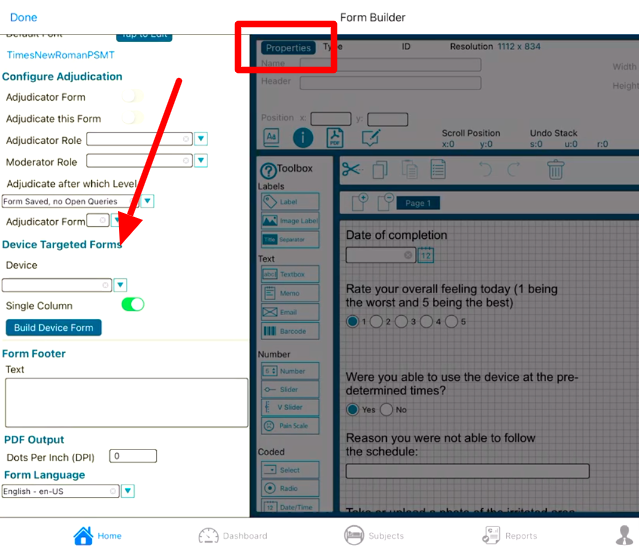
Select a device or language to target. The list of options comes from the Device Dictionary section described above.
There is also an option to force the layout into a single column if desired. Depending on the screen width and current form layout, this may happen anyway.
Then tap the Build Device Form button.
Caution
There’s no need to tap save on the parent form. To see the new form that was just created, exit the current form by opening the forms manager and selecting the newly created child form as described next.
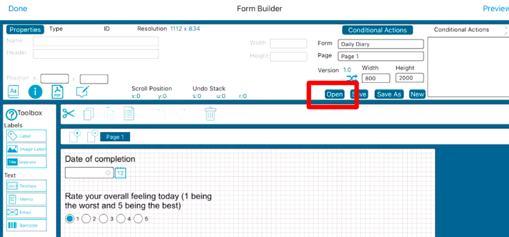
In the background, the system will instantaneously re-arrange the form layout to fit the device width being targeted. The new form referred to as a child (targeted) form, that was created can be accessed in the Form Manager screen. It will have the same name as the parent form followed by a number. You will also see a description of the device it's targeted for, based on how you defined devices in the device dictionary.
If a different language was targeted, this process will also use Google’s Translate API to interpret all the text and labels on the form. Further revisions to the translations can be made as needed.
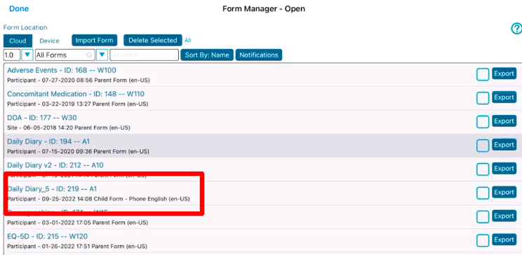
Open the child form by tapping on it.
Review the layout that was generated by the system, change the layout or item sizes as desired, and save the changes to the child form.
CAUTION
Do not add new or delete fields on a child form. If a change must be made to the form, variables, or logic, make the change on the parent form and then re-create the targeted form so the form variables and behavior match. Form Targeting should only be used to alter the layout and presentation of forms or form labels.
Updating Language Text On Forms
Forms can easily be targeted to support different languages, or updated entirely to a different language after the form is built. It does this by running the form text through the Google Translate APIs and then providing a means to export all the text to a file so it can be translated outside of the system, and then the ability to reimport that file.
The reason for this approach of manually updating the text via a file is because the machine translation will not likely be 100% accurate.
All of this is done via the Form Properties.
Testing for language forms
If the form translations have been done on child forms, when testing to make sure a targeted language is opening, it is important to have your device language or browser language set to the same language to which the form(s) have been targeted. If the system continues opening the parent form, it's either because the language doesn’t match the device or the form width can’t be used.
Note
To display targeted language forms on the web, set the device dictionary width to 300.
Language of the User Interface
Creating translated forms is the most important task when users will be entering data in their native language. However, it’s important to also consider the remainder of the TrialKit user interface for those users to see in their own language. Fortunately, that part is handled automatically by the device or browser settings.
On the mobile app, if the device is set in any of the supported languages mentioned above, the user interface text labels will display in that language. Read here on how to change device language for Android or for Apple iOS.
On a web browser, if the user’s browser is set to use any language and automatically translate sites, the browser itself will translate all text from it’s original language to the desired language. Read here on how to change device language for Chrome or for Microsoft Edge.