Customize Web and Mobile Screen Appearance
TrialKit was created to be an internal solution for its users. As such, it can be customized from several areas for your studies. This helps provide custom content to your users and differentiate the study you have created. As an example, content customization allows you to provide instructions, notifications, or contact information to users that is specific to a particular study.
Host Theme vs Study Theme on the Web
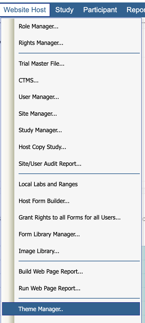
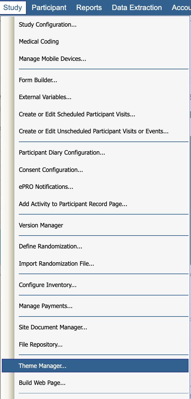
The site appearance (theme) can be customized for the Host account as a whole and the theme for each study can be customized. This is why a similar Theme Manager option is seen in the following two locations:
Host Level Theme | Study Level Theme |
|---|---|
Website Host menu > Host Theme Manager: | Study > Study Logo and Theme: |
|
|
To elaborate, if there are multiple studies running on your account, the appearance can be set to dynamically change when you switch between those studies. If the theme is not customized at the study level, it will default to the account (host) theme. If the account theme has not been customized, it will default to the standard TrialKit theme as shown above. Here's an example of a site that has been customized:
Below are the various elements which can be edited. See each number and the matching area where it applies on the screen below.
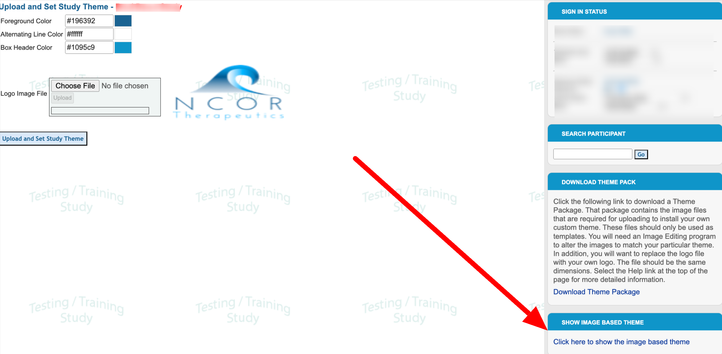
Foreground color - Color of table headers and buttons throughout the system
Alternating line color - the row color on tables throughout the system
Box header color - Color of the section headers in the right panel and form banners
Logo - Displayed in upper left header area

Mobile App Branding
A logo can be defined for displaying on subject forms within the mobile app as well.
That is configured from study configuration functionality.

Legacy Theme Settings
The legacy settings are also accessible that give image-based control of the headers.

Those settings are defined as follows:
.png)
Foreground Color - Menu bar - TrialKit Theme color is 208FBF.
Alternating Line Color - Rows of tables anywhere throughout the system. The enrollment table above is an example. The trialKit Theme is D4EDF8.
Logo Image - Shown at the left of the header area at the top.
Header background - Shown in the header area at the top.
Box Header - Shown in the header of the boxes on the right side of the page.
Title Bar - The column header on tables throughout the system. The enrollment table shown above displays an example.
Additionally, the Home page and Contact Us page content can be tailored for both the host and study levels.
Note
When updating the logo or theme appearance, in order to see the changes right away after saving, it is often necessary to perform a hard refresh on the browser, or sign out and back in. In Chrome, this in Cntrl+F5 on a PC, or Cmd+shift+R on a Mac/Linux.

