Data Collection Objects and Attributes That can be Configured on Forms
This article covers all objects and field types placed on forms within the form builder. The mobile app supports some additional field types not supported on the web browser. These are noted in the table of contents list below.
Jump to any section:
Adding Fields and Objects To a Form
Adding Fields and Objects To a Form
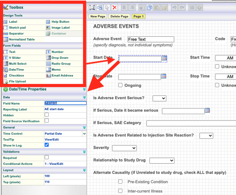
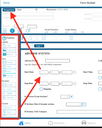
Fields can be dragged out from the toolbox onto the form canvas. Once a field is on the canvas, tap the desired field to access the corresponding field properties. Examples are shown below on both the web and mobile app interfaces.
Web Browser:
Mobile App:
Each form object has its own set of unique properties. These are included in the corresponding descriptions of each field type below. Some properties are common across all field types.
Common Field Properties
These are properties common to all types of fields. They can be seen by selecting any field on a form within the form builder.
Field Name (data fields only)
The variable name was given to the field (data fields only). This is alphanumeric with no spaces. This is where naming conventions like CDISC or SDTM can be used.
The maximum length of field name is 30 characters. Field names can only contain letters A-Z, numbers 0-9, and the underscore _.
The field name cannot be changed once data has been entered or the study version is published.
The system reserves some words. This will be indicated when the form is saved.
Reporting Label
A more user-friendly name is given to a variable/field. It will be displayed throughout the system instead of the main Field name if this exists. Ad-hoc reporting and data exports display the field name by default.
Hidden
Hides the field in all scenarios for any user viewing the form in data entry (still shows in data exports). A common example/use-case is where a Number field is used to compute a value that users don’t need to see during data entry.
While this can be a useful tool, sometimes it is better to blind a field to a specific role(s), so that some users are still able to see/verify the data directly on the form.
Field Source Verification (FLSV)
Forces field level review for the workflow review level where FLSV is enforced. This adds a ‘Lock’ icon next to the field when being viewed by the applicable review user.
Tooltip
Displays text to the user when hovering over the field with a mouse.
NOTE: Available on the web browser only.
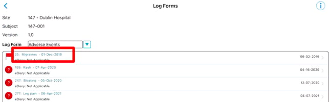
Show in Log
Display the field in the log table if the field is part of a Log Form. The web browser will default to use the field reporting label as the column header. If it is not defined, it will use the field name.
If the field is blinded to certain roles, those roles will see ***Blinded*** as the data in the table.
Web Browser:
Mobile App:
Only the first two log fields are displayed on mobile in data entry.
Required
Make a data variable required when not being hidden by a condition. An error displays to the user when the field is left blank.
Required will not work on Checkbox fields since checkboxes are always either True or False.
Show In CTMS
This will cause the field to display within the CTMS data tables for convenient viewing - similar to how Log Forms display the fields with 'Show in log' enabled.
Conditional Actions
Create custom field logic and edit checks. Read more about Conditional Actions here.
Layout
Sizing in width and grid location on the form.
Blinding
Hide the field to specific user roles. Read More About Blinding here.
Labels - Non-Data-Storing Objects
Text Labels
Labels identify data-collection objects ("Fields") within a form so users entering data know what needs to be done.
When a label or design tool is dragged and dropped into the form builder, the label or tool becomes active. To edit an existing label or design tool in a form, click on the label or design tool to make it active.
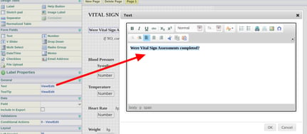
When clicked, the Properties for the label or design tool will display in the properties section of the Form Builder, as shown above. The label text and formatting can then be edited.
Formatting:
On the web form builder, the system will default the formatted font and size, so each text label needs to be individually formatted as needed.
On the app form builder, users can define a default format at both the study level and the form level. This is very helpful to speed up the building process. On the app, in the form properties, the default font can be defined. It can also be defined at the study level within the study configuration settings for new forms that are created from scratch.
Please don't use the label editor to paste large amounts of pre-formatted text from another external source. This can cause layout issues with the form when displayed on a web page. Text labels should typically be used for single sentences or phrases.
If a large amount of content is needed, like instructions for users, try using a help button to embed larger quantities of text in a popup window.
Text Label Properties
Field
A label can be related to a specific data field, allowing the label to be hidden when a hidden conditional action is added to the label’s associated field.
The label associated with a field will be displayed as the data field's label in the data extracts if the data field does not have the reporting label field completed.
Include in Export
Allows the label to be exported in the data extracts.
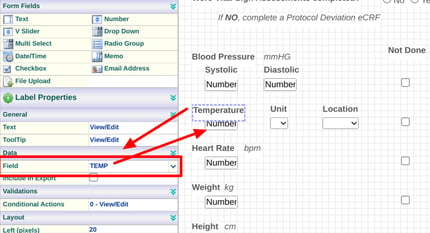
In the example below, the weight field has two labels, but we want one label to be displayed in the data extracts next to the actual weight value. To do this, be sure the unit label is related to the weight field and the box to Include in Export is checked.
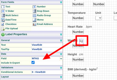
When a label is exported with the data in a data extract, it will have a column name matching that of the field it is associated with an "_Label" attached to the end. For example, in the above image, the "Kg" label will be included in the data exports next to the Weight value (PE_WT) and have a column header titled "PE_WT_LABEL." The label will appear as data down that entire column.
Image Label or Spacer
Displays a static image similar to how a text label displays static text. To select an image to display within an image label, it first must exist in the central Image Library.
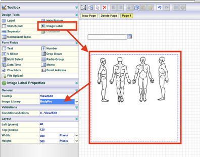
Sizing the label: It's recommended to set the image size in Pixels, as shown above. If the image is made bigger than the original uploaded file, it will lose resolution, so uploading a larger source file in the image library is necessary.
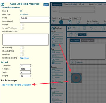
Audio Label (App Only)
Record an audio label (through field properties) which allows a very descriptive message.
Use Label as a Spacer
If no image is defined for the image label, it will display as an invisible object that can serve to separate objects apart from one another. When using an image label as a spacer, include the property “Upon Render, Omit Outline.”
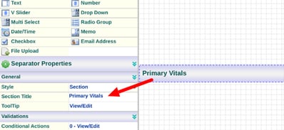
Separator
A visual separator bar to split up sections of a form. There is no functional purpose of a separator. They can be conditionally hidden if needed and labeled with any text.
Audio Label
Audio labels can be used to attach a pre-recorded audio message to the form. This is done by recording a message directly within the field properties.
Button
Buttons can embed reference information, such as documents, external URLs, or bodies of text, into a popup window. They are useful to simplify a form and focus on the data entry rather than putting large amounts of text directly onto the form.
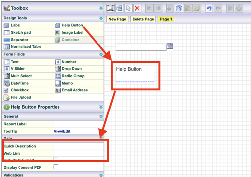
The key factor of a button is what will happen when the user taps on it. There are three options detailed below.
- Open a popup window containing pre-defined text
- Open a new browser page/URL
- Open a PDF Consent document (applicable only if the form is used as the study's consent form)
- Open DICOM files list
These functions outlined below follow this priority if there is more than one configured: DICOM files, Quick help text, Open a web page, consent PDF.
For this reason, only configure the one that is intended.
Properties Specific to Buttons:
Window Size (Mobile only) - The percentage area of the screen that the popup window should consume for viewing.
Report Label - The text is displayed on the button itself.
Webpage URL - Opens a specified web URL. Use your own pre-existing URL, or read here on how to create custom web pages within the system to create links.
When defining a URL in the help button properties, the complete URL must be defined. Example: http://www.crucialdatasolutions.com.
Not including the protocol (typically http or https) will prevent the page from opening.
Quick Help Text - Opens a window with help text for the user to read.
Display Consent PDF - This will map the button to the consent PDF defined within the Informed Consent configuration settings and usually mapped to the site-specific Informed Consent document uploaded in the Site Documents Section.
Using this option will override the other two options above.
The uploaded Informed Consent document that you upload in the site documents must not have any spaces within the file name.
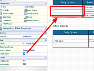
Table (Normalized Table)
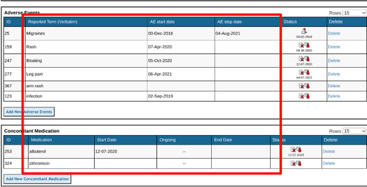
A Normalized Table is a sub-form used to log repeating records of data within a single ‘Parent’ record where the table exists. A common use-case is a Medical History form, where an unknown history is needs to be collected at a single point in time during a subject's screening, but the amount of data collected is variable for each subject, so it's often necessary to have a table within the form so the user can enter data all at once.
The alternative to this is a Log Form where the user can enter a record, save it, and then enter a new record.
It is recommended that normalized tables only be used if the form will only be collected once, and the table does not need more than 8 columns. If either of those is not the case, a log form should be used.
Normalized Tables can be dynamic or fixed. By default, they are dynamic, where the user adds rows on demand. A pre-defined number of rows will be displayed if set as Fixed, and the user cannot add new ones.
When a Normalized Table is placed into a form, the Form Fields dialog box opens to allow for dragging new Fields onto the table.
In this example below, a radio field has been placed into a table. Tapping on that row then provides access to the properties for that field.
To add the column header, type in the Label column highlighted in yellow above. If the header is long, you can use a <br> tag to break the text into a new line when it's displayed in the table. This prevents the column in the table from being too wide when the header text is long.
Properties Specific to Normalized Tables
Fields View/Edit - Select this to open up the list of field types included in the table. Drag a new field into the table or reorder fields.
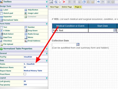
Maximum Rows - This will set the maximum number of rows that can be added to each defined normalized table. The maximum is 100 rows per table.
Report Name - Users enter names for each table to help identify the table when extracting data. For example, a user could enter the Medications Table to signify that the information collected in this table contains Medications.
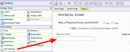
Fixed Rows -Users may want a normalized table with a fixed and required number of rows. The fixed rows attribute allows the user to define a normalized table with a fixed number of rows. The first field/column in the table determines how many fixed rows there will be.
The first column must be a dropdown field when defining a Fixed Row table. The field choices will determine the number of rows in the table.
Here's a common example in a Physical Exam where specific exams are conducted, and all are displayed without the user needing to manually enter one at a time.
All choices in that first column will automatically show as unique rows during data entry. The user cannot edit the first column.
Data Fields (Data-Storing Objects)
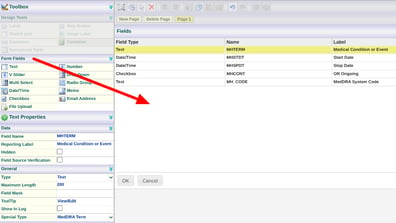
Text
Stores single-line text data (alphanumeric).
Maximum Length
The Maximum Length field allows the Form Designer to set the maximum number of characters allowed in the field. If the Maximum length is not defined, the default length is ten characters. To designate a Maximum Length for the field, enter the desired number of characters for the field to accept.
Field Mask
The Field Mask allows the Form Designer to set a pattern of how the text should appear in the field when the data needs to be entered in a certain way.
For example, to create a text field to capture a telephone number, set the Maximum Length to 14. Then, set the mask so that the code appears as a telephone number (###-###-####). When a telephone number is entered in the form, only the numbers, not the dashes, will need to be entered.
Basic masking rules are as follows:
9 - number only
a - lower case letter only
A - upper case letter only
# - anything
The characters described here define what the user will be allowed to enter. Any other character used will be counted as a "literal," meaning it will be displayed as-is.
If the intention is to populate a text field fully, when the user does not need to enter any text, field masking should not be used. In that case, the suggested method is to use a text label and set the label to be included in the data exports.
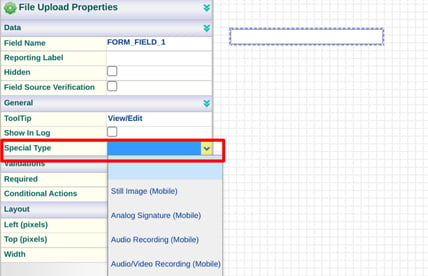
Special Type
The Special Type dropdown control allows users to designate the field for a special purpose, including:
- Medical Coding attribute.
- Name of a randomization configuration - for populating a Randomization ID.
- Barcode (mobile) - Adds a barcode scanner to the field when displayed on the mobile app.
- ICD lookup - Allows a user to click on the field to open a quick search for ICD codes. Read more here.
Regular Expressions (RegEx)
This allows a study designer to require specific formatting in a text field based on a predefined expression. You can read here for more info about regex functionality. This field property is also available in memo-type fields if longer strings of text are required in data entry.
A Regex error message can also be defined. This will fire as a query if the data entered does NOT match what the expression requires.
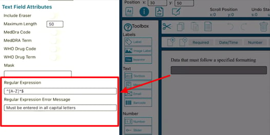
RegEx Examples:
Use any available chat AI tool to ask for an expression to accomplish your objective. One example is ChatGPT
| Objective | Expression |
| Only allows entry of First, Last Name | ^[A-Za-z]+(?:\s+[A-Za-z]+)+$ |
| Only enter numeric characters 0-9 with a maximum limit of six characters | ^[0-9]{1,6}$ |
| Alphanumeric string, upper and lowercase characters, with a minimum limit of 10 and a maximum limit of 20 | ^([a-zA-Z0-9_-]){10,20}$ |
| Only allow 10 numeric digits | ^[0-9]{10}$ |
| Must be a 10-digit US phone number with hyphens included | ^\d{3}-\d{3}-\d{4}$ |
Memo
The Memo Field allows for the storage of large amounts of alphanumeric text information. This data type is commonly used for notes, comments, or descriptions.
Maximum Length
The Maximum Length property allows the Form Designer to set the maximum number of characters in the field. The system default is 3,000 characters. Enter a value in the Maximum Length property to set a different limit of up to 10,000 characters.
Special Type
Memo fields can be set to serve as a WHODrug route or med code field for forms that are being medically coded.
The Email Address Field is a text field designed to store text formatted as an email. Only syntactically correct email addresses are accepted in the field when the form is completed.
When an Email Address form field is dragged and dropped onto the Form Builder body/grid, the Email Address Properties appear in the Toolbox, as shown in the figure below.
Special Type
Subject Email - Used for ePRO studies to set the email field as the one that will collect/register an email as a Participant user in the study. Data collected in a field with this property will be blinded in data exports and reporting. However, it will still be visible on the form for any users that are not blinded to it.
Mask E-Mail
The email will be masked with hidden characters when typing within the form by checking this.
Barcode (Mobile App Only)
A Barcode scanner is a text field with access to open a camera (when completed via the mobile app). When the camera is opened, it will scan for one of 21 different barcodes or QR types to pull the text automatically into the data field. Additionally, if applicable, FDA device registry data can be automatically pulled into other fields on the same form.
Use the Barcode field type to add a barcode field within the iOS form builder. Use a text field on the web form builder and set the special property type “Barcode,” as shown below.
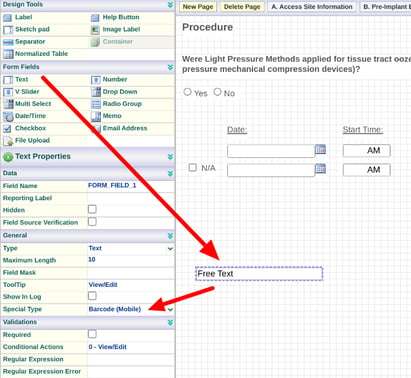
Set the field length to the proper length to fit in the entire bar code. The default is 10.
If a user enters data via the mobile app, they can directly open the device's camera to scan the barcode ID into the text field by tapping the icon next to the field.
Mobile App:
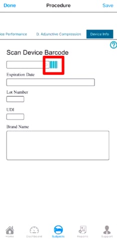
FDA Device Registry
Barcode fields can also pull public FDA information into other fields on the form to quickly gather extra information if the device is registered.
To auto-fill device data from the FDA's database, the following field naming conventions must be used, where the items below need to be appended to the end of each of the corresponding fields:
_DEVBARCODE_003
_EXPIRATION_DATE_003
_LOT_NUMBER_003
_UDI_003
_ISSUING_AGENCY_003
_DI_003
_BRANDNAME_003
_VERSIONMODELNUMBER_003
_COMPANYNAME_003
_GMDNPTDEFINITION_003
Number
Number fields store numerical values. Both decimals and whole numbers are supported. The Number Properties selected for the Number field determines which numerical format is accepted.
Maximum Length
The Maximum Length field allows the Form Designer to set the maximum number of numbers allowed in the field. If the Maximum length property is not defined, the default length is six numbers. To designate a Maximum Length for the field, enter a value in the maximum length property.
Decimal Places
The Decimal places field allows the Form Designer to define the number of places accepted after a decimal. For example, To set the number field to display 23.46, the Maximum length should be 5, and the Decimal places should be 2. If the Decimal Place property is not defined - the field defaults to zero.
Special Type
Slider (Horizontal Slider): Used to provide end-users the ability to slide an indicator on a horizontal slider. This is set on numeric fields only and can be used effectively on pain scale forms. The visibility of that value depends on the settings. This is created within the web form builder by setting a regular number field with the special type property “Horizontal Slider”.
Vertical Slider
The Vertical Slider Scale (VAS) allows the Form Designers to provide a vertical scale in which the user can use their finger to slide on a scale to a particular numeric value if using the Mobile App.
The unique properties of the VAS field are the following:
- Tick Attributes - This allows the Form Designer to change the size, spacing, and number of ticks that will be displayed on the scale.
- Ball Size - Controls the size of the ball the user grabs and slides up and down.
- Upper Descriptor - Sets the text to be displayed at the high end (top) of the VAS field.
- Lower Descriptor - Sets the text to be displayed at the low end (bottom) of the VAS field.
- Number of Steps - Works with the step increment to set the scale's high value. For example, if you have five steps and 2-step increments, the top of the scale will be 10. If only 1 step increment were used, the max of the scale would be 2.
- Step Increment - How many steps will be shown on the scale? If two steps are used with ten steps, the user will see 2, 4, 6, 8, …y up to 20 for the max value of the scale.
- Start Step - The Form Designer can start at the bottom of the scale.
- Score Box - When the user slides the scale up and down, the value or “score” of where the slider stops is shown to the left of the slider control.
- Score Label Title - The Form Designer can name the value or “score.” For example, the Pain Scale
- Hide Score Box - If “On” will hide the value or “score” of the slider from the user.
Due to the touch requirement, this field type only renders on the mobile app. The web form will display as a manual number entry.
Pain Scale
Stores numeric value data with input limited to pre-defined options on a chart.
A tappable standard numerical horizontal scale of 1-10 is commonly used to rate pain.
This can be added by setting a number field’s special type property to “pain scale”.
The field will be rendered on a form only on the mobile app. The web will render this as a number field.
Other than size, there are no customizable parameters for this scale type.
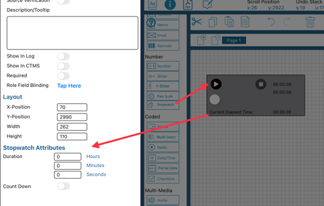
Stopwatch
The stopwatch is a number-storing object that presents the user with a counting utility on the form. This can serve as a convenient timing function for performing an activity for the form. It will not control any other functions, but will store the final number of seconds in the field.
Additionally, a specific threshold can be defined that the stopwatch will count down from.
Single-Select Dropdown
Stores a coded value along with decoded text for each value.
The Drop Down Field is used to create a list of choices a user may select when completing a field on a form. When the user selects a choice, the field displays that choice in the Drop Down field in the form.
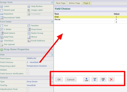
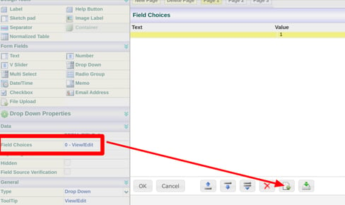
Field Choices
Accesses the list of choices for editing. Use the tools at the bottom for adding new rows above/below the currently selected row, or delete options.
Web Browser:
The value must be a non-negative number starting with zero. No other limits exist regarding the order or sequence they must follow. These values can also be used in scoring scenarios where multiple different choice fields are factors in a computation somewhere else.
Mobile App:
Importing choices from another code list on the same form:
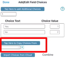
Copying and pasting a choice field is another way to recreate a list in a new field. This can also be done across forms.
Batch Importing Coded Choices
Choices can also be imported to prevent the necessity of manually typing them in. This is done via a 2-column CSV file, with "Text" and "Value" as the column headers:
- Column 1: Text - Text of the choices you want to import
- Column 2: Value - Has the value of the corresponding text
Example:
| Text | Value |
| Female | 1 |
| Male | 2 |
| No Specified | 3 |
Web Browser:
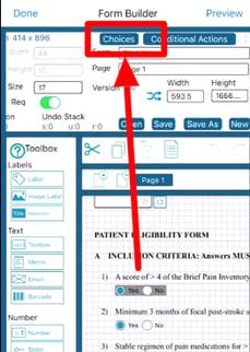
Open the choices editor on a dropdown field and tap the import button.
Choices can also be exported to be used in another field.
Mobile App:
The file must be saved using the .csv file extension and placed in the TrialKit folder within your iCloud Drive.
If you uploaded the file to your iCloud drive from another device other than the one you are using, you will need to download it locally.
Tapping the import button below will bring a list of CSV files available to upload from your iCloud>TrialKit Folder. Select the file you are importing and tap the import file button.
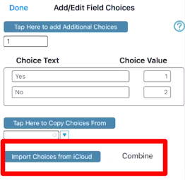
The "Combine" option allows you to add to the existing list or start a new one.
When OFF it will create a brand new list from your imported file.
When ON will append your choices to the existing list of choices already set for the field.
Because choice values must be unique, when importing choices, if a value already exists in the choice list that matches the choice list that is being imported, the next available value will be used to assure uniqueness among values.
Special Type
Used to Map the Choices to one of the following:
- Country List
- Language List
- Visit Interval
- Inventory Lists - displays items from inventory. Read more here.
- Medical Coding attributes
- Local labs
- Versions - Displays all study versions for a user to select from. They are commonly used for site consent documents.
- Timezone - Displays a list of all system time zones. Applicable for ePRO studies. Read more here.
Adjudication Final
This attribute is only applicable to forms being built to perform adjudication. Enabling this on a choice field tells the system that this variable should be compared during the adjudication moderation step.
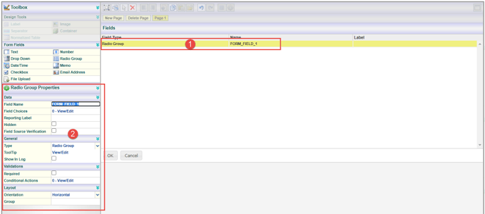
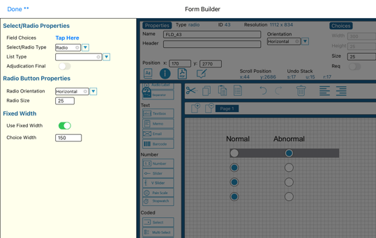
Single-Select Radio
Stores a coded value along with decoded text for each value. These are similar to the dropdown fields described above but allow the user to see all choices on the screen rather than first tapping to expand a list.
Radio Field Orientation
Allows for displaying the radio choices as a horizontal list or a vertical list.
Fixed Width Radio Field
This allows for defining a set width for each radio button, for horizontal orientation only. The text label will also be hidden, based on an objective of displaying repeating similar table-style answers. The width can be manipulated to spread out the buttons to any extent required.
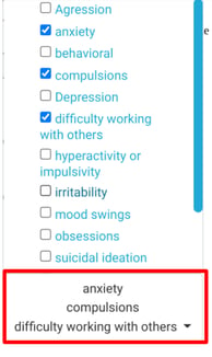
Multi-Select
Stores a coded value along with decoded text for each value as a comma-delimited string. This can be used when a user needs to select 'all that apply' instead of having multiple checkbox fields.
Once choices in this field are selected, it will display up to five selected choices without the field being expanded. If more than five selections have been made, it will read, for example, “6 selected”. A user viewing the form later on would need to hover or tap on the field to see which choices were selected.
Considering the use of checkboxes or a multi-select field:
- Checkboxes are separate variables and will be presented as unique columns in the data exports
- A checkbox is always true or false (never blank), but a multi-select field can be blank
- If an edit check is needed to see if the 'x' number of choices is selected, checkboxes would be needed
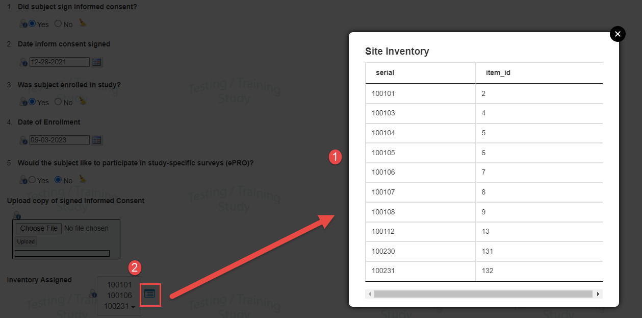
Selecting Multiple Products From an Inventory List
A unique aspect of this Multi-Select field type is its use when mapped to Inventory via its “special type” field property. It will display an icon next to it, opening a popup reference window of the inventory available at the current site. Here's an example of the popup displaying the following:
1. Site inventory.
2. Trigger by clicking the icon to the right of the field as shown below.
Checkbox
Stores a value of True (checked) or False (unchecked).
Checkboxes do not support the 'Required' field property because a value of false is still a value. Similarly, an edit check on a checkbox cannot check for it being blank or not blank.
Checkbox Text
This sets a visual label to go with the checkbox (not shown in data exports). An alternative is using a label separately like other field types. The difference is that using an embedded label via this property helps the form render the checkbox and label as one object and keep them in better alignment.
Be sure the checkbox width is set long enough to support the text label if used. Otherwise, the text may wrap underneath the checkbox.
Paper Consent
Applicable for studies using eConsent, but where some patients in the study are providing consent via any other means.
If the form where the checkbox resides is the registration form for the study, select this option for one checkbox on the form. The system will use this to check if the patient should be forced to consent electronically or if consent is being provided another way (a checkbox gets checked on the registration form for that patient).
Date/Time
Date/Time fields collect dates and times on a form. For all Subject CRFs, at least one is required as the visit transaction date.
Date/Time Type (Time Control)
- None - (Date only) Only the date will be entered by the user. This will need to be a complete date. If the user deletes a part of the date, the system will auto-fill it to make it a real date. This is the most common option used.
- Time - (Date+time) The user will enter Both the date and time. Due to the field type, this must be a full date+time. Users will not have the option to keep either one blank if only part of it is known. To allow users to add one or both, we advise splitting the date and time into separate fields or adding a checkbox for the user to tick if one portion is unknown.
- Time with seconds - Similar to the Date+time field, but also includes seconds.
- Time Only - The user will enter only a time
- Time Only with seconds
- Partial Date - Read more below
Note: The appearance of the field in the form builder may not reflect the time control option chosen. The form can be tested in the Subject Manager to view how the users will see the field and perform the data entry.
By default, all users on the system will see the 24-hour time format on all time fields. Users can independently change their preferences to the 12-hour format if they choose.
When users enter midnight as a time in 24-hour format, some will input 2400, and others will enter 0000. If entering 24, the system automatically kicks the value down to the next acceptable value, 23. The accepted format for midnight is 0000.
Birthdate
Any full date on any form can be set as the Participants birthdate. The system will use this date within any conditional actions that reference the constant "Participant Age". This is so an accurate internal computation can be done dynamically to get the age of the Participant.
It may also be used by the eConsent module to help the system know when consent needs to be revoked.
Partial Date
Data is stored as text but displayed to the user like a date. Users will be able to enter a year only, a month+year, or the full date. Any part of the date that is deleted will be auto-completed with zeroes. If the month is deleted, the day will also be automatically zeroed out.
Partial Dates will only be displayed in the format DD-Mon-YYYY, regardless of the user's preferences.
Points to consider:
- The system cannot use partial dates as the form's transaction date.
- Partial dates can be used to compare to other dates or values within conditional actions. If that is done, the system assumes 01 for the day and January for the month in cases where the data is incomplete. (e.g. 00-000-2022 is assumed as 01-Jan-2022 within the conditional action).
- Do not change an existing time date field to a partial date; you need to delete and start with a new field and name.
Interval Diary Trigger
This is a list of the study's interval diary configurations (v2 diaries only).
The form where this date exists should also be the form that the diary configuration is set to trigger off of.
Setting the diary trigger for a date will cause the chosen diary to build its schedule off of the date that users enter into this field.
Things to be aware of:
- If any diary is set up in the study, this is required to make that diary function.
- The date entered by the user will serve as the first interval of the schedule. Every other interval will be based on the configuration, using that first interval as the starting point.
- If this date is collected multiple times (in a log form or across multiple visits), the chosen diary will build its schedule based on the record with the most recent visit date (using the visit transaction date field)
- If separate diary iterations (configurations) need to be built of the same date field, a separate date field will be needed for each diary configuration.
- It's usually helpful to also hide this date if the subject's email field is blank. This prevents the system from building a schedule for subjects that are not Participant users in TrialKit.
Interval Diary Stop
This is also a list of all interval-type diary configurations. It will be the date that the diary schedule ends. The schedule will be based on the diary configuration maximum forms if this is not indicated.
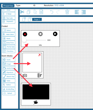
Multi-Media Types
All media type fields described below get stored as files attached to a record but collectively accessible within the study's file repository.
File Upload
Stores files that users need to upload. Any format is supported.
In data entry, it looks like this:
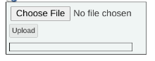
When users upload a file, it is stored in the File Repository and attached to the site/subject/form where it was saved. Users will be able to access it from the form or the file repository.
Most common file types are supported, except for executable or script files.
Data exports and reports referencing a file will display the file name and ID. The files themselves need to be downloaded from the file repository.
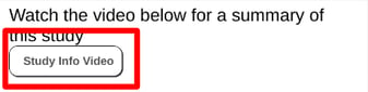
Audio, Image, and Video
Stores media files captured directly by the device from the form where it's initiated.
On the web browser, Image or Video capture will be displayed as a file upload field for uploading the media file. Audio fields will allow the user to record directly using the device microphone (browser permissions must be granted).
The intention of media capture directly on the form is to reference an image or a short video. Be aware that video fields should not be used to capture long videos. Any video up to 10 minutes will likely cause issues with saving the form.
As an estimate, a 10-minute video taken directly in a video field could take 30 seconds to save.
Web Browser:
These fields can be added to a form by using the file upload field and setting the special Type property.
Mobile App:
On the mobile app, the user can tap to record video or audio directly. Here's a view from the iOS app form builder.
Audio fields can be set with a maximum duration to automatically stop the recording after a specified number of minutes.
Signature
This upload field Stores an image file of a handwritten signature. It allows a user to use drawings on the screen to create a signature image. The Image gets stored as a file on the form - similar to an upload or media field.
On the web browser, add an upload field and set the special type to Analog signature.
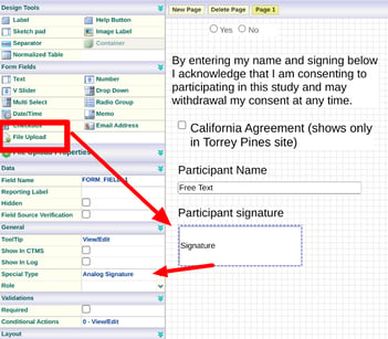
Use the signature field object directly available in the toolbox on the mobile form builder.
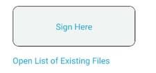
During data entry, users will see a box like this that they can either sign directly or tap to sign.
Enforcing Signatures
The following options exist to enforce signatures, from most strict to least
Required signature - If a signature is set as required, the form cannot be saved until the signature is added. To specify a role that must sign, use the Role property.
Role - Optionally assign the signature to a specific user role required to sign it. Other roles cannot see the signature field on the form unless they have permission to view all signatures.
Blinding or Hiding - The signature field can be conditionally hidden or blinded to specific roles, but not required.
Sketch Pad (Mobile App only)
Stores image file of an annotation on top of a predefined static image.
Web browsers will only display the image but not allow for drawing.
Mobile App:
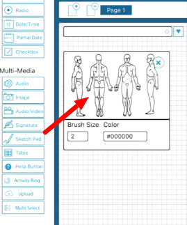
The image itself can be set via the Background property. When a user in data entry draws on top of it, the image gets stored as a single flat file.
The unique properties of the sketch pad are the following:
- Background Image - Allows the Form Designer to select an image to be displayed as the background of the Sketch Pad. The background images to choose from are stored in the Image Library. Images will be sized to fit the size of the Sketch Pad box. In other words, if the image is distorted, adjust the field size to the appropriate height/width.
- Brush Site (1-20) - Allows the Form Designer to set the brush size used to draw on the Sketch Pad area.
- Color (RGB) - The Form Designer can choose the brush color used when drawing on the Sketch Pad by sliding the amount of Red, Green, or Blue colors. A preview of the color will be shown in the properties panel. By default, the color is set to black.
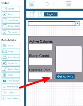
Activity Ring - iOS Only
Stores Apple HealthKit activity ring data.
This field allows the user entering data, when connected to an Apple Watch, to pull in activity data for that day.
Mobile App: